Earlier today the first 20 minutes of gameplay from the retail version of inFAMOUS: Second Son were leaked, and interestingly enough they include a scene that was shown during the E3 2013 trailer.
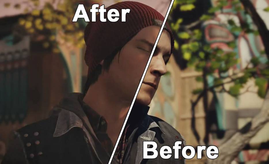
Even more interestingly, the new version of the scene looks very different, showcasing changes in lighting and time of day and even some redesigned environments, as you can see from the screenshots below (the version from E3 2013 is on top of each pair, while the retail version is under it).
Under each pairing you can also find an animated GIF to see the evolution of each scene better. Click on each picture to see them in their full size and to start the animation.


Animated GIF


Animated GIF


Animated GIF


Animated GIF


Animated GIF


Animated GIF

The scene below is especially interesting, as in the E3 2013 trailer it portrays Delsin mocking the DUP with his graffiti art. In the final version of the game he uses it to mock his brother Reggie, showcasing an actual change in content and a different take on the story itself.


This kind of difference is not too surprising, given that several months have passed since the earlier trailer, and game development is normally very fluid, with assets that get reshuffled and remade, and effects that get switched over pursuing the artistic vision of the developer.
A possible reason for the change in lighting is that the original version's stronger shadows due to the direct sunlight (it looks like noon-ish) effectively hid some of the feature of the characters, making the nuances of their expressions less visible, while the sunset lighting of the new version has more evenly distributed lights and shadow, allowing the expressions to stand out more. It's very visible in the fifth pairing, where Delsin's frustrated expression is almost completely overpowered by the shadows and he almost looks like he took a punch to both eyes.
Of course that's just my personal speculation, so take it with a grain of salt.
Whether the new version looks better or worse is mostly a matter of taste, as beauty is in the eye of the beholder, but it's interesting to see how the game evolved over the past nine months.
One thing is for sure, I had quite a lot of hands-on time with the game just two days ago, and it looks absolutely stunning. You can expect my preview very soon.
Update: Since some will take every possible chance to flame (or to be overly defensive), I feel compelled to clarify something: Not once the article mentions a "downgrade" or an "upgrade," and that's because there isn't ground to mention something like that. The article mentions differences, and there are indeed differences in lighting, time of day and environmental design. In addition to that at least a scene has been changed in its content. The comparison is not about quality and visual fidelity. It's a simple before and after face-off to show how a game evolves in nine months of development.
"Difference" does not mean downgrade. It doesn't mean upgrade. It means "difference." That's all there's to it. The scene portrayed simply looks radically different. It doesn't look necessarily worse or better. Just different.
Update 2: Sucker Punch firmly denied that any visual downgrade has been made since the E3 build.
Update 3: a further comparison from another scene shows the opposite change in lighting, demonstrating that effectively there hasn't been any downgrade, just an artistic choice, as Sucker Punch mentioned.