Just about everyone visiting DualShockers today will open the main index page and be presented with a "mobile" looking design.
We have revamped the site from the ground up to not just improve the speed in which page loads, but we have also redesigned the site to provide a cleaner and simpler adventure -- something that we believe will provide a less convoluted experience. To provide some insight on the decisions made, I'm going to explain the reasonings for this direction.
Colors (Or lack thereof?)
Why all the white? The "white" design gives us the opportunity to add color where it matters. By doing this, we ease how your eyes navigate through the page, focusing on the more "dominant" colors and allowing your field of vision to focus on what is important, which is the content. The contrast allows us to spotlight meaningful aspects of the page.
Index Page (Main Page)
Post layout on the index page is being revised. We are working on providing post dates, author by-line, and categories associated with the posts.
Header

You will notice that we have removed horizontal links and, instead, have vertically placed everything inside the "hamburger" menu icon. As a gaming site, we are prone to have large number of categories which, over time, will become difficult to read or even draw attention. With the new iteration, we are making the categories more legible while also bringing a leaner encounter to make navigation a bit friendlier.
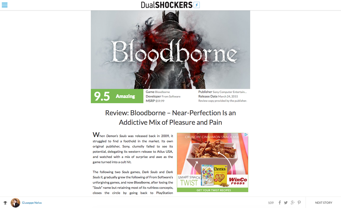
Post Pages
Post pages have been stripped to bare the minimum of just containing the content you want to read. While it may seem bare, the reasoning behind this was to introduce a less intrusive experience when reading the content you chose to read. Traditionally, sites are designed to promote a large selection of content on every page; and while we feel this is works for some, placing unrelated links/content on a post page adds unnecessary congestion that has little to no relation on what you, the reader, really care for: the post.
We wanted to remove distractions and focus on bringing you a more refined means of reading about what you came to read. Additionally, to keep the content you read relevant, we are going to be working on implementing a more prominent "related articles" section within the post pages to provide visitors with an array of posts specifically related to the article, keeping the experience harmoniously relevant.
Footer
The main landing page will no longer have a footer. Rather, we have condensed elements and redundant pages by compressing fundamental components within the new menu. We have introduced "infinite scrolling" which will allow you to cycle through older stories dynamically without the need to "reload" the pages.
On post pages, however, we have introduced a static footer which displays the post category, the author of the post, the number of comments, and a "sharing" section that will allow you to share posts within your social network.
You will notice that we have also introduced a "Next Story" button which will allow you to cycle to the next post. This was influenced from the experience of reading video game magazines and how we wanted to somehow integrate that same experience within our site to provide users the ability to "turn the page."
Note: We are aware that there isn't a "PREVIOUS STORY" button and that is something we are working on implementing very soon.
What's Next?
DualShockers will continue to make improvements. The design was done with you, the reader, in mind. As we move forward, we will be continue to polish how you experience the site. Most importantly, your feedback is essential with how we adjust, so please do provide us with your input. This site is for you and we want to ensure that you enjoy how you venture into it.
As of now, we are focusing our efforts on:
- Reducing page load speed
- Refining the layout (Index page; Page condensation; etc)
Thank you, everyone. We look forward to your feedback.